It’s been a while since our reporting suite’s interface got a proper update. While the data underneath has always been robust – unlike many other expense tools, we’ve always offered real-time visibility into your corporate spend – the experience around it was overdue for a change.
The value of a report is only as good as your ability to find it quickly, run it accurately, and navigate the system effortlessly. Over time, as features accumulate, reporting suites can become cluttered and overwhelming.
That is why we are excited to introduce a completely modernised reporting navigation experience. We’ve redesigned the user interface from the ground up to maximise application responsiveness, unearth your data, and dramatically simplify your overall workflow.
Why we rethought the reporting experience
Our main goal for this release was discoverability. We wanted to take the friction out of finding the exact insights you need. Instead of presenting a daunting, messy list of options, we have reimagined the navigation into a clean, curated, and logical interface that significantly reduces desktop clutter.
Here is a look at what is changing in your dashboard today:
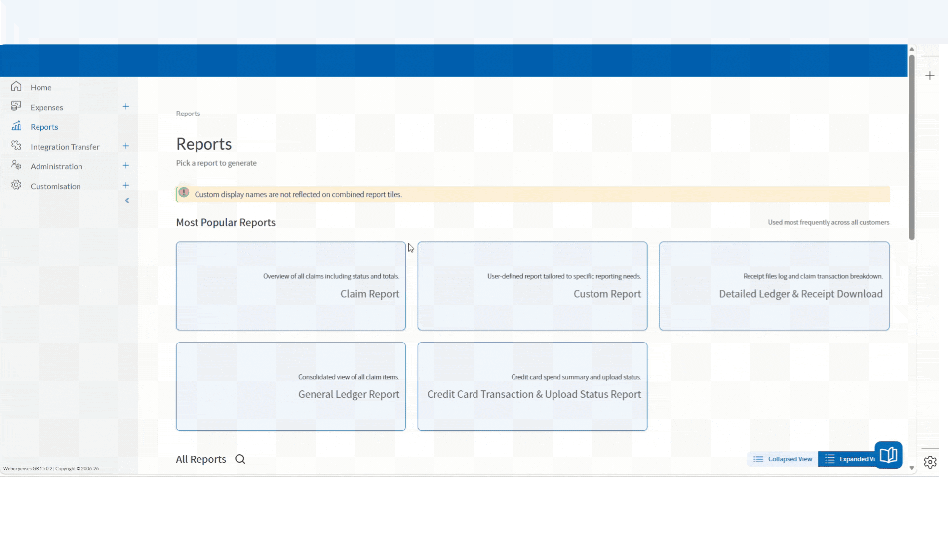
1. A clearer, curated starting point
When you open the new reports section, you will be greeted by a ‘Most Popular Reports’ section. This surfaces the core tools finance teams reach for most regularly – including the Claim Report, Custom Report, Detailed Ledger, General Ledger, and Credit Card Transaction Report – right at your fingertips.
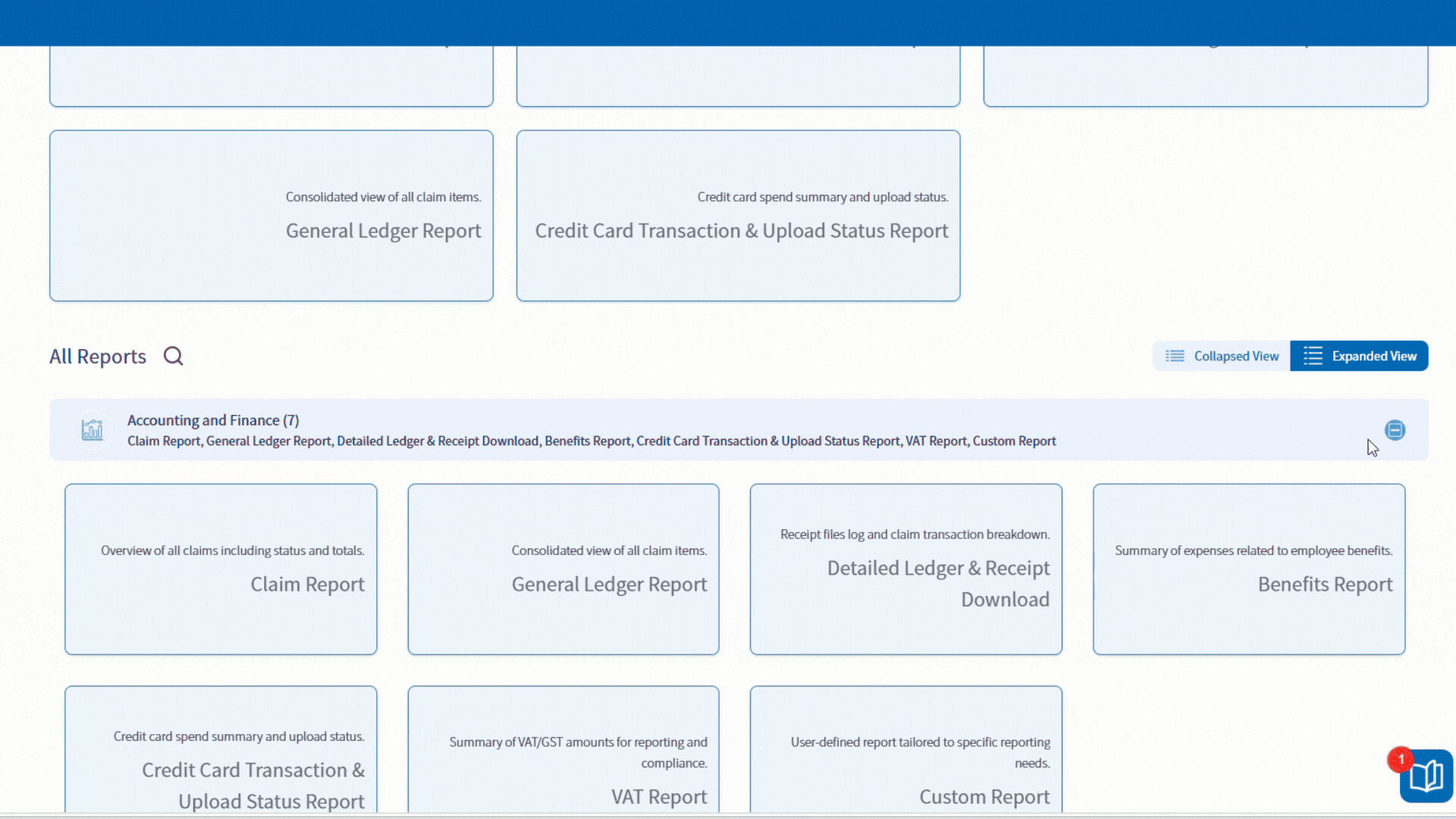
2. Streamlined categories and reduced clutter
Everything else has been organised into clean, expandable accordion categories (such as Accounting and Finance, Company Details, and Reimbursements).
To keep the workspace tidy, we have also merged several related reports into single, unified views – such as combining Vendor and Vendor Details, and Detailed Ledger and Receipt Downloads. You get the same powerful functionality, with a fraction of the visual noise.
3. Smart search usability
Looking for something specific? A new search bar now sits directly above your report categories. Results update instantly as you type, supporting partial matches while ensuring users only see the specific reports they have permission to access.
4. Smoother workflows and automated reporting
To speed up your day-to-day tasks, your report parameters are now saved for your active session. If you need to quickly replicate or tweak a report you just ran, your filters remain intact, so you can regenerate data in seconds without starting from scratch.
We have also automated how the system handles larger or historical data requests. Rather than making you manually check date parameters or route through separate “Offline Report” menus, the dashboard now handles the heavy lifting quietly in the background.
If a report requires background generation, Webexpenses simply processes it and alerts you the moment it is ready for download, keeping your workspace fast and uninterrupted.
Always improving
This UI overhaul is just phase one of a much larger vision for Webexpenses reporting. We are constantly developing and pushing the boundaries of what our platform can do.
While this initial release focuses on maximising navigation simplicity and look-and-feel, our engineering teams are already hard at work on phase two backend enhancements. Future iterations will bring even deeper functionality, including the ability to save permanent report templates across sessions and expanded data criteria configurations.
We build our platform around your feedback. To see what else we have planned for the future of reporting and beyond, check out our Public Product Roadmap.
The updated Reports Dashboard is now live for all Webexpenses customers – take a look via your left-hand navigation menu in the app.