If Webexpenses looks a little different lately, that’s not a glitch. We’ve changed how it looks, not how it works. Nothing has moved and nothing works differently.
We’re calling it the ‘core interface refresh’ internally, but the name matters less than what it means for you: everything still works the way you’re used to, it just looks tidier.
That’s the short version. Here’s what’s actually changed, what’s still coming, and why we’ve done it this way.
What’s changed so far
Our refresh started with reporting. In June, we rebuilt the reports interface on a new, dedicated reporting service, rolling out first to APAC and then EMEA a day later.
The specific improvements we were aiming for:
- More consistent navigation.
- Reports that are easier to find in the first place.
- An updated search function.
- A reporting workflow that feels cohesive.
Since then, the claim report and the credit card transaction report moved onto the same reporting service, and at the end of July, we refreshed the navigation menu across the product.
In late August, the Detailed Ledger Report made the same move, along with a fallback option, so a single report can revert to the previous version if it ever needs to, without disrupting anyone else’s experience. Card admin screens picked up the new colour palette around the same time.
None of this changed how you use the product. It changed how it looks, and in most cases, how quickly you can find what you need once you’re in there.
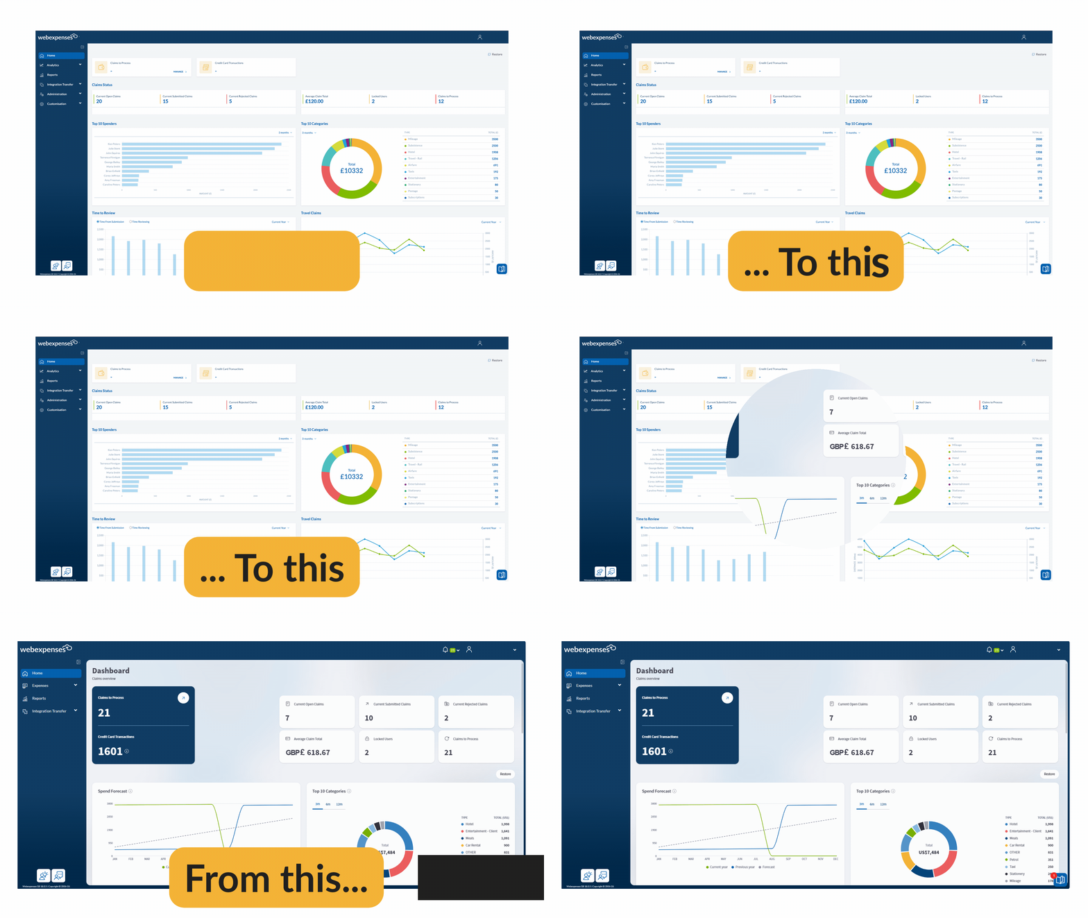
The core UI refresh is now live
Phase 2 of this redesign went live on 24 September 2026. It covers the admin and accounts dashboard and the My Device screens moving to the new interface, along with a full reskin of the reports, card programme and integrations screens you’re already using in their newer form.
Think of it as the same visual language extending further across the product: a pale blue background, content sitting on white panels, and a consistent set of colours for buttons, icons and labels throughout.
Because releases go out region by region, you might see some of this before a colleague does, or after them. If your screen still looks like the old version, it’s coming. Nothing has been held back or removed, it’s simply a question of when your part of the world gets it.
Why we’re doing this
Webexpenses has grown a lot of screens over the years, each one built at a different point with a slightly different look. The refresh brings them all back onto one design system, so the product feels consistent whichever part of it you’re in.
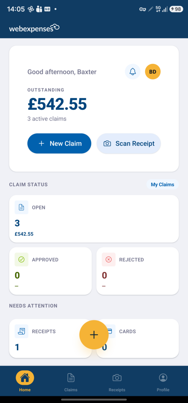
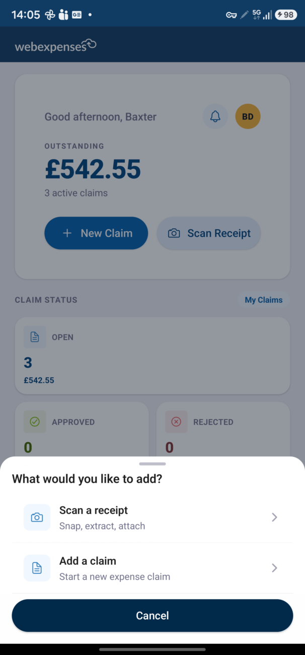
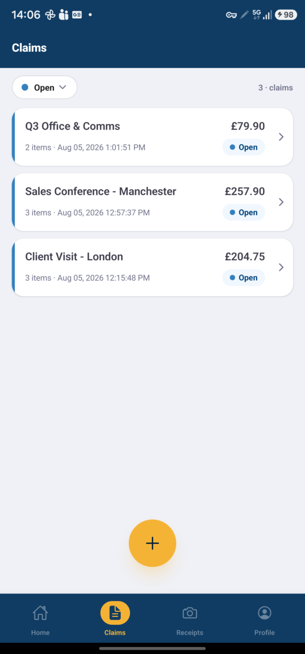
There’s a practical reason behind this too. A single design system is easier for our product team to build on, which means we can ship improvements faster from here.
This refresh isn’t the end goal in itself. It’s the groundwork for what comes after it, and you should expect to see more changes land more quickly once it’s finished.
We’ve kept this update visual. Your workflows, your navigation, your day-to-day process haven’t changed. If something looks different but works the same, that’s exactly the point.
We know how disruptive it is when a tool you rely on daily gets rearranged without warning, so we’ve been careful not to do that here.
If you want to see exactly what’s changing as it happens, you’ll find each update logged in our release notes as it lands. Otherwise, the short version is the one that matters: same product, same workflows, just tidier.
If anything looks off or you’re not sure what you’re seeing, get in touch and we’ll sort it. Contact us >